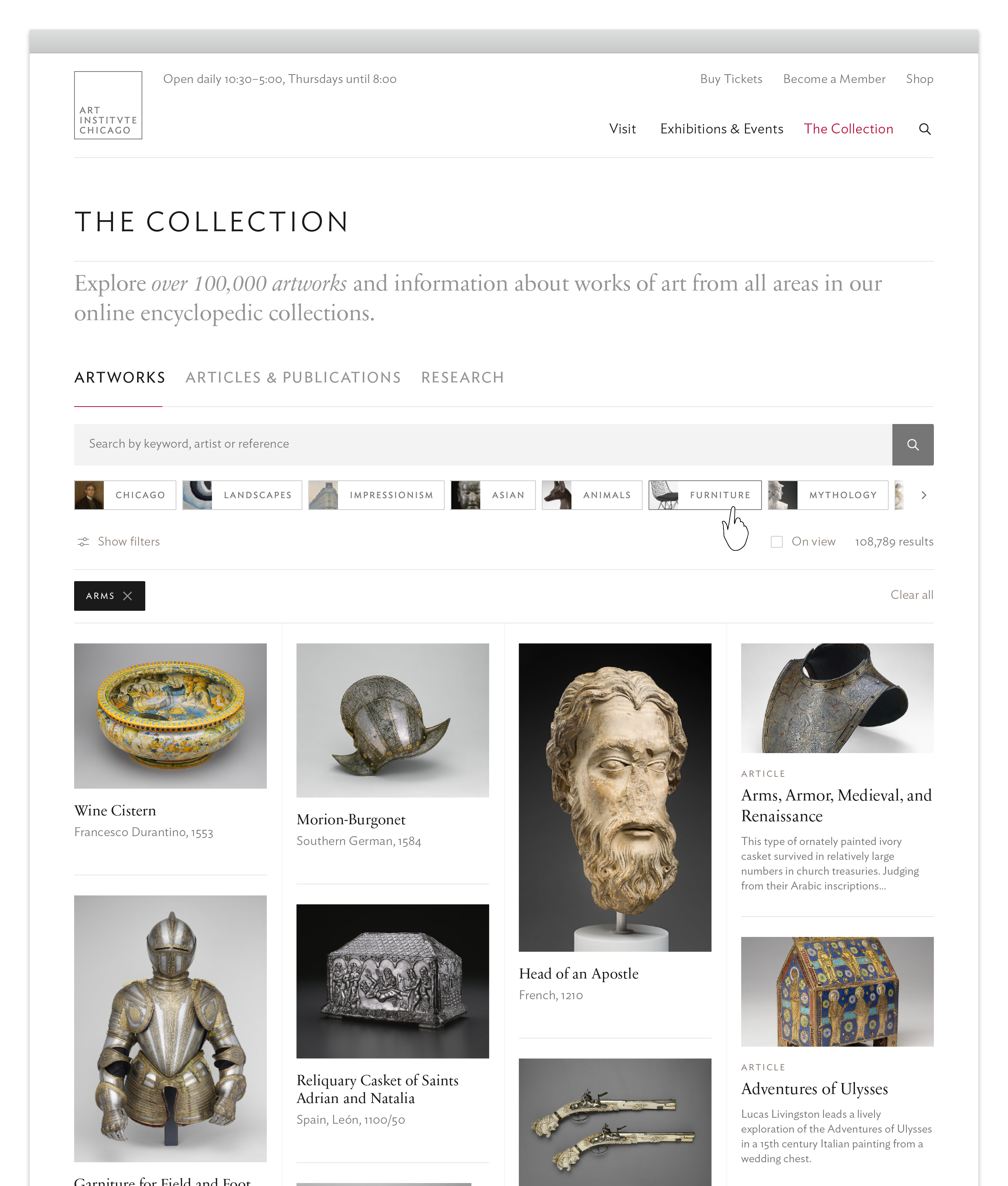
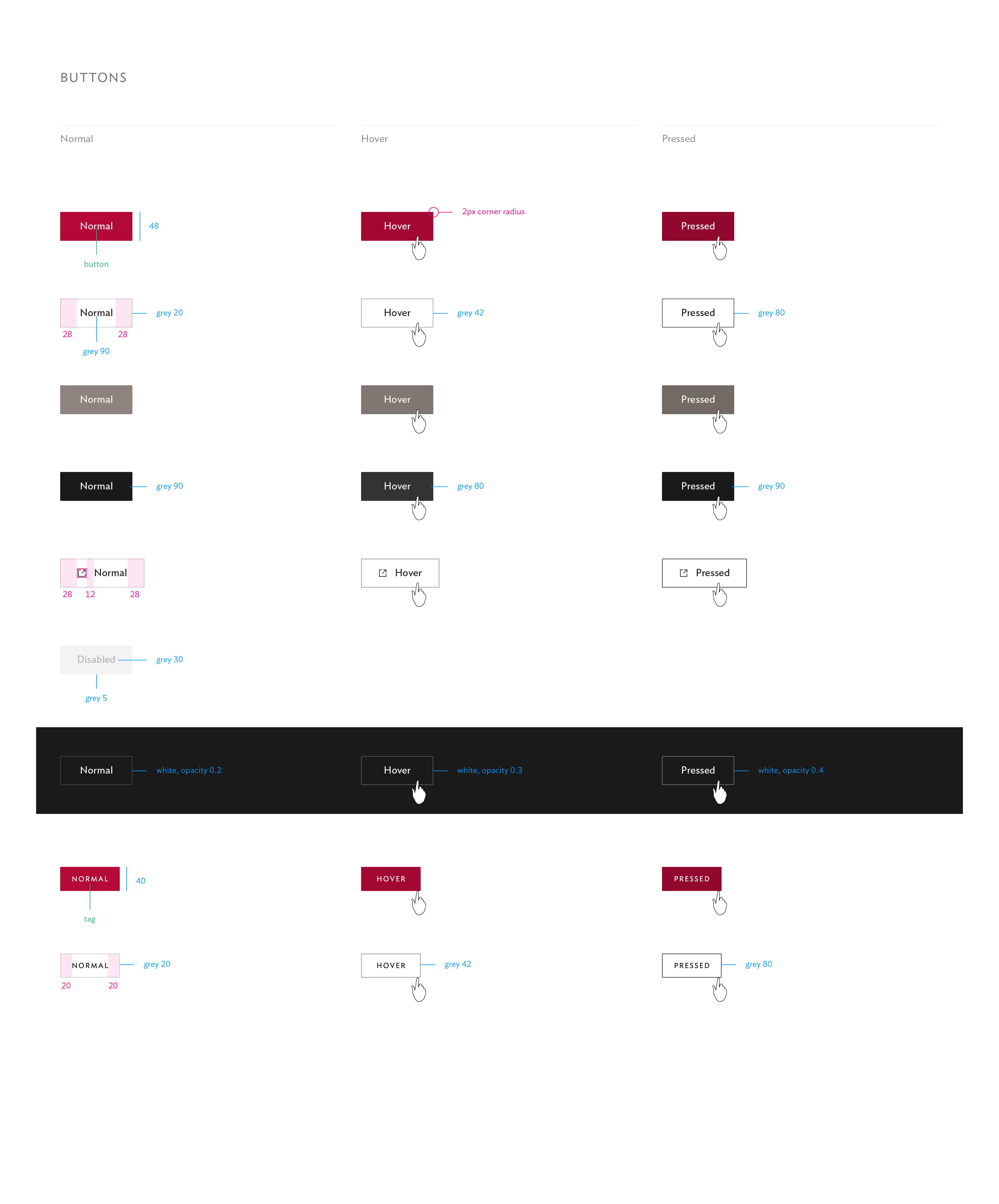
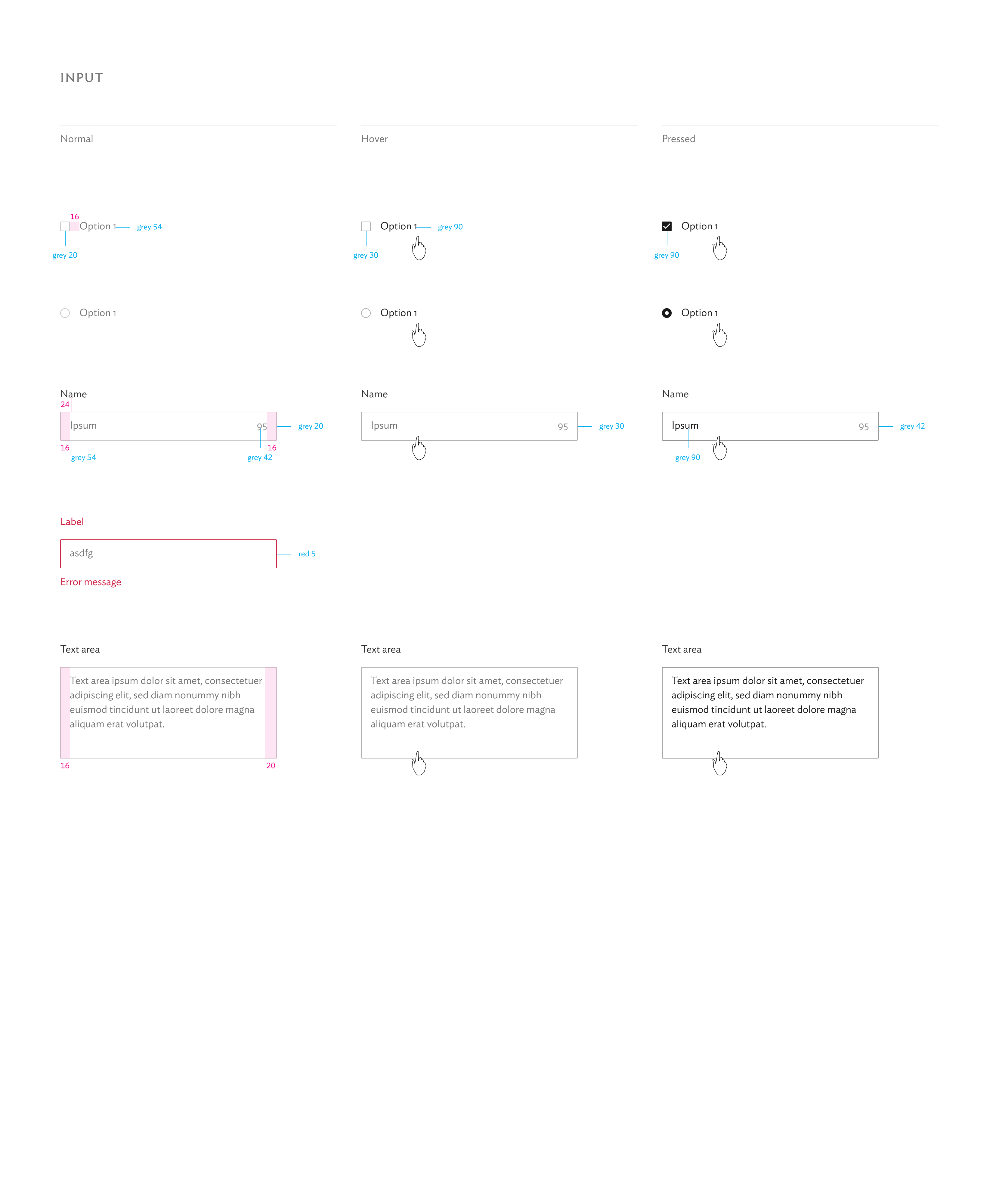
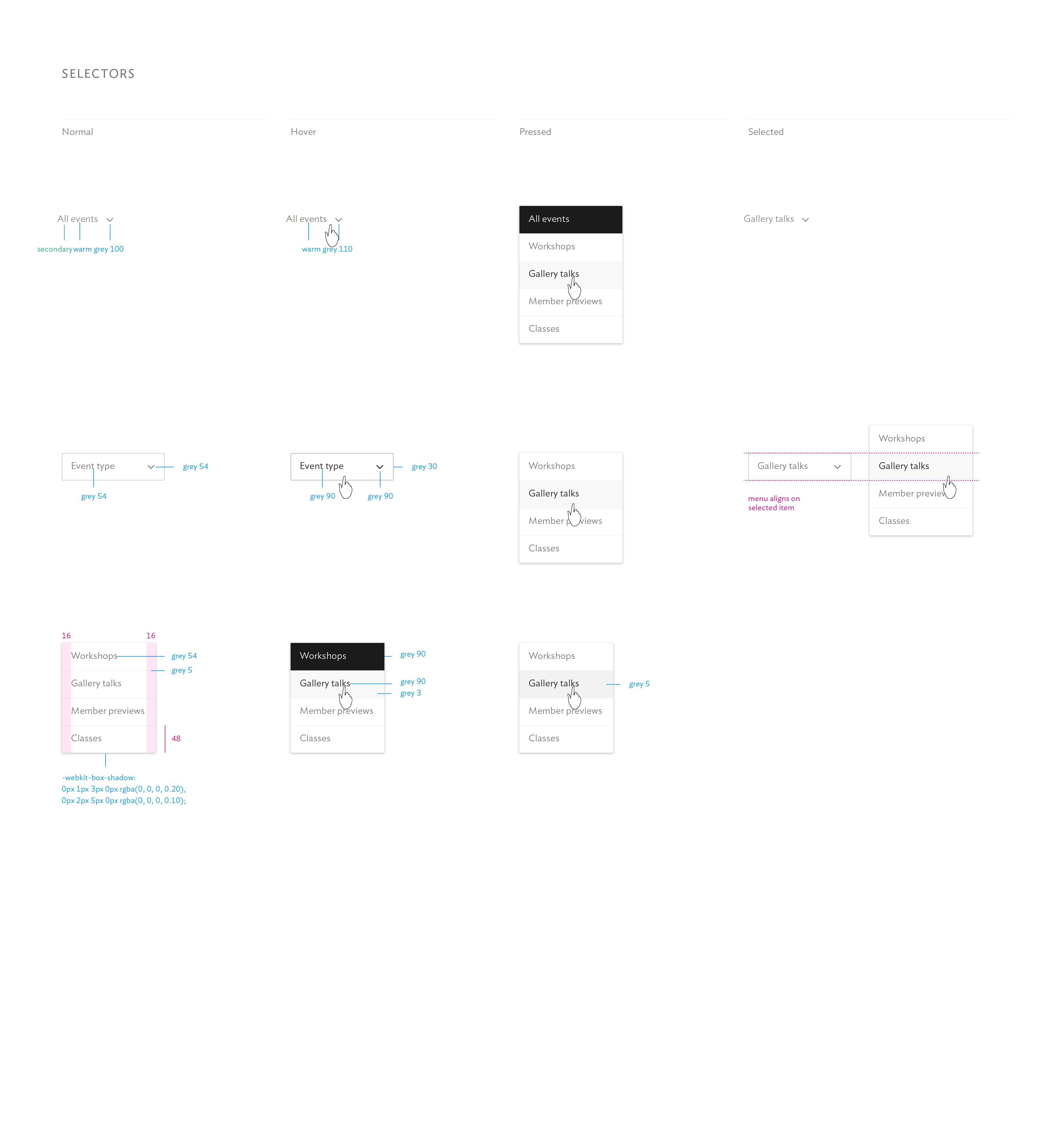
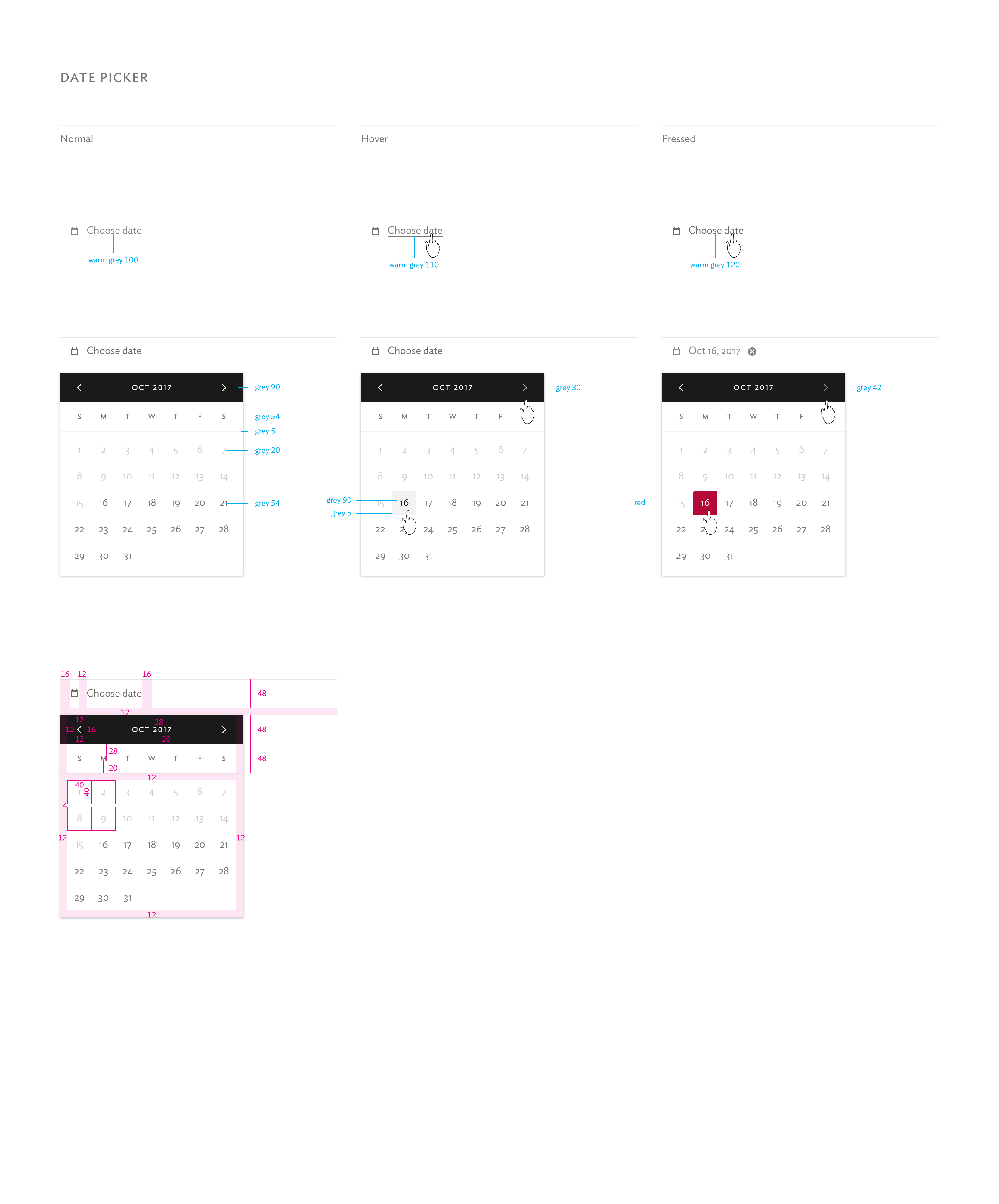
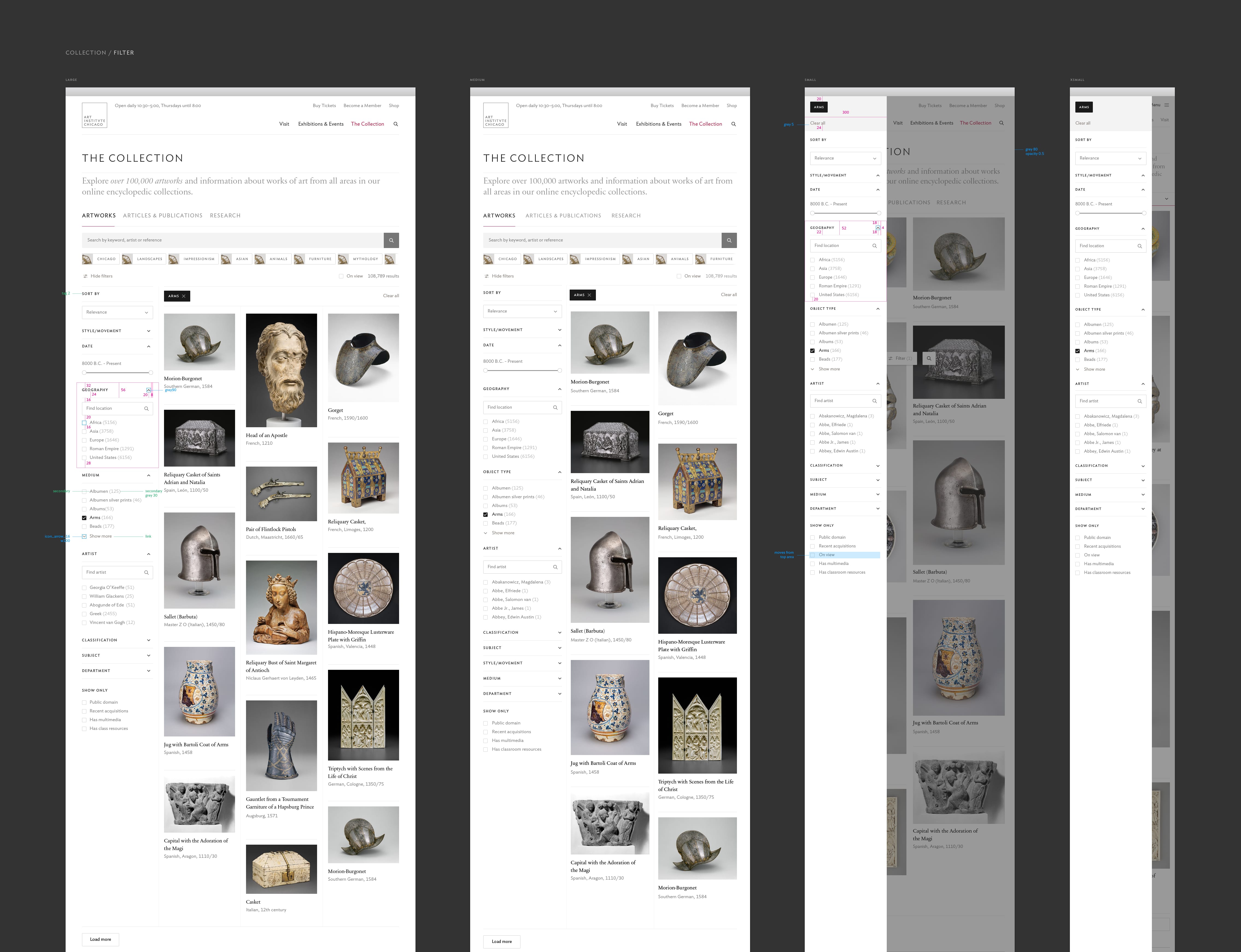
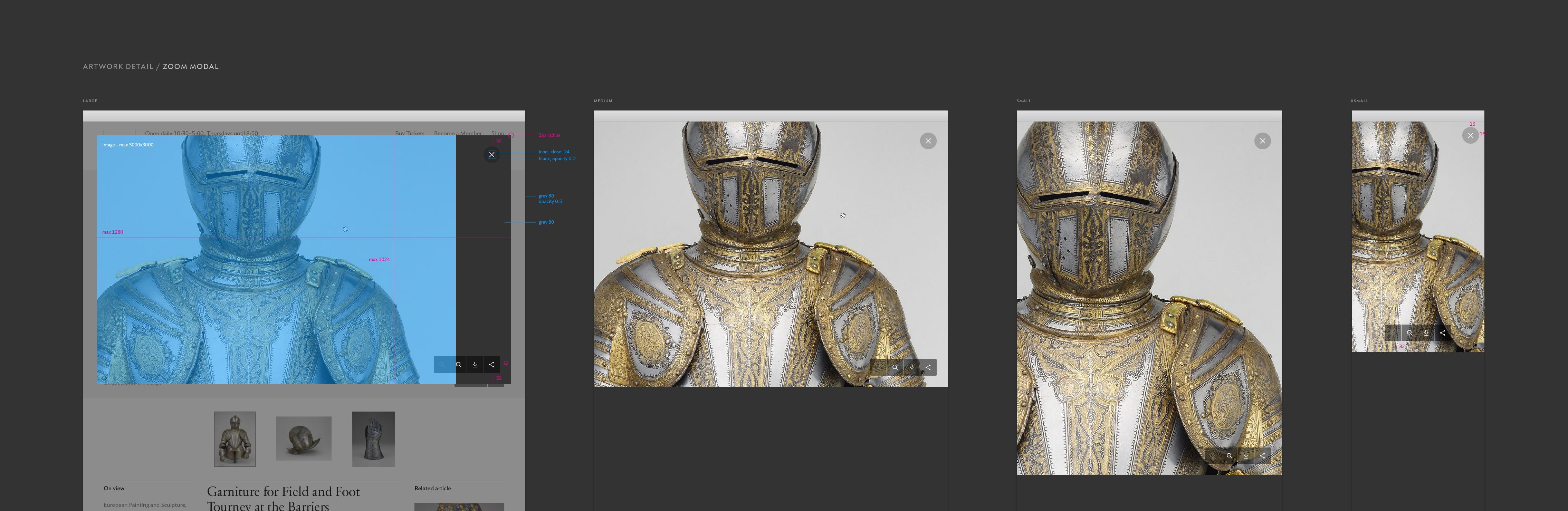
The AIC design features a 58-column grid inspired by Karl Gerstner’s design for the journal Capital, providing added flexibility compared to a typical 12-column approach.
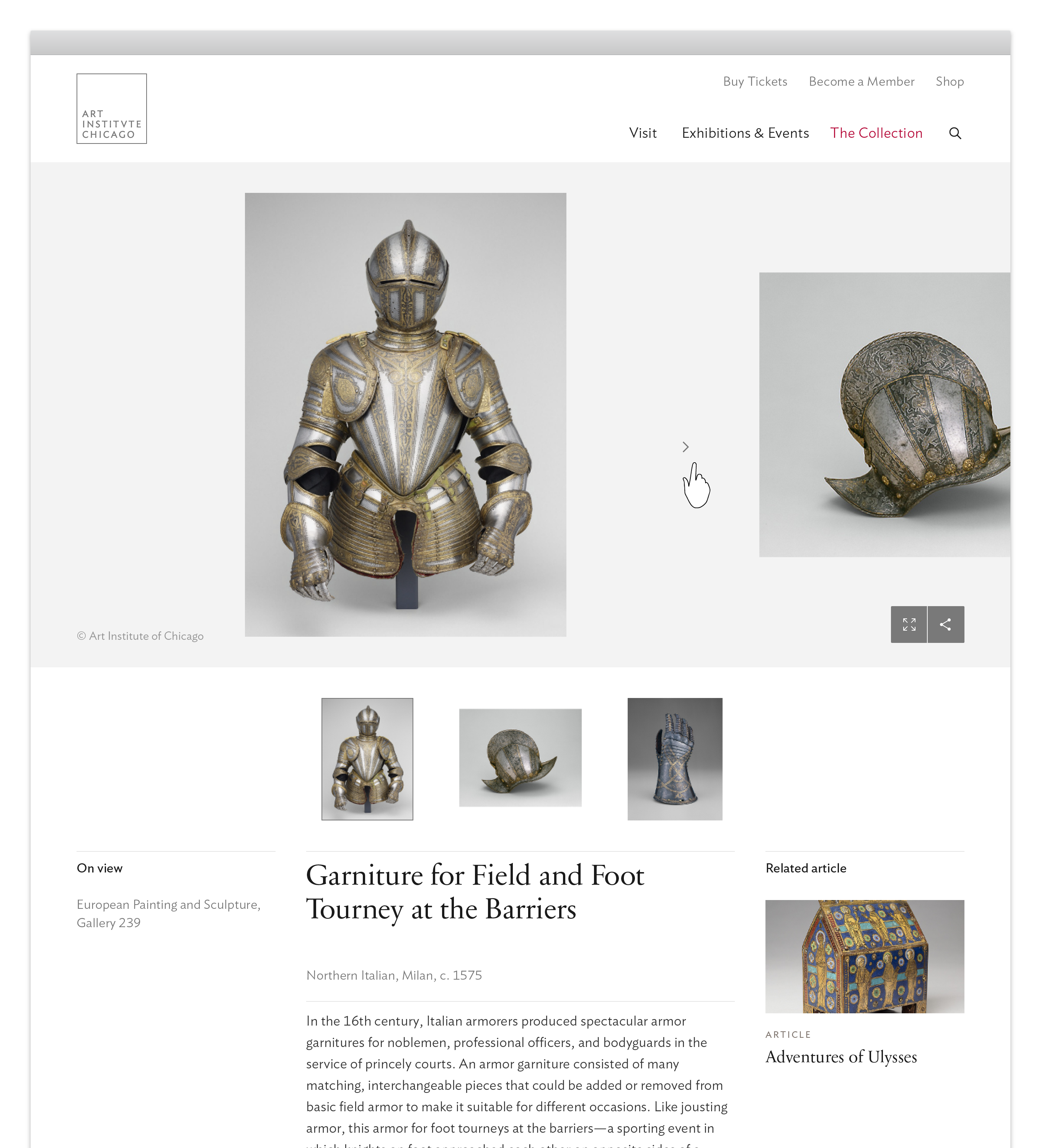
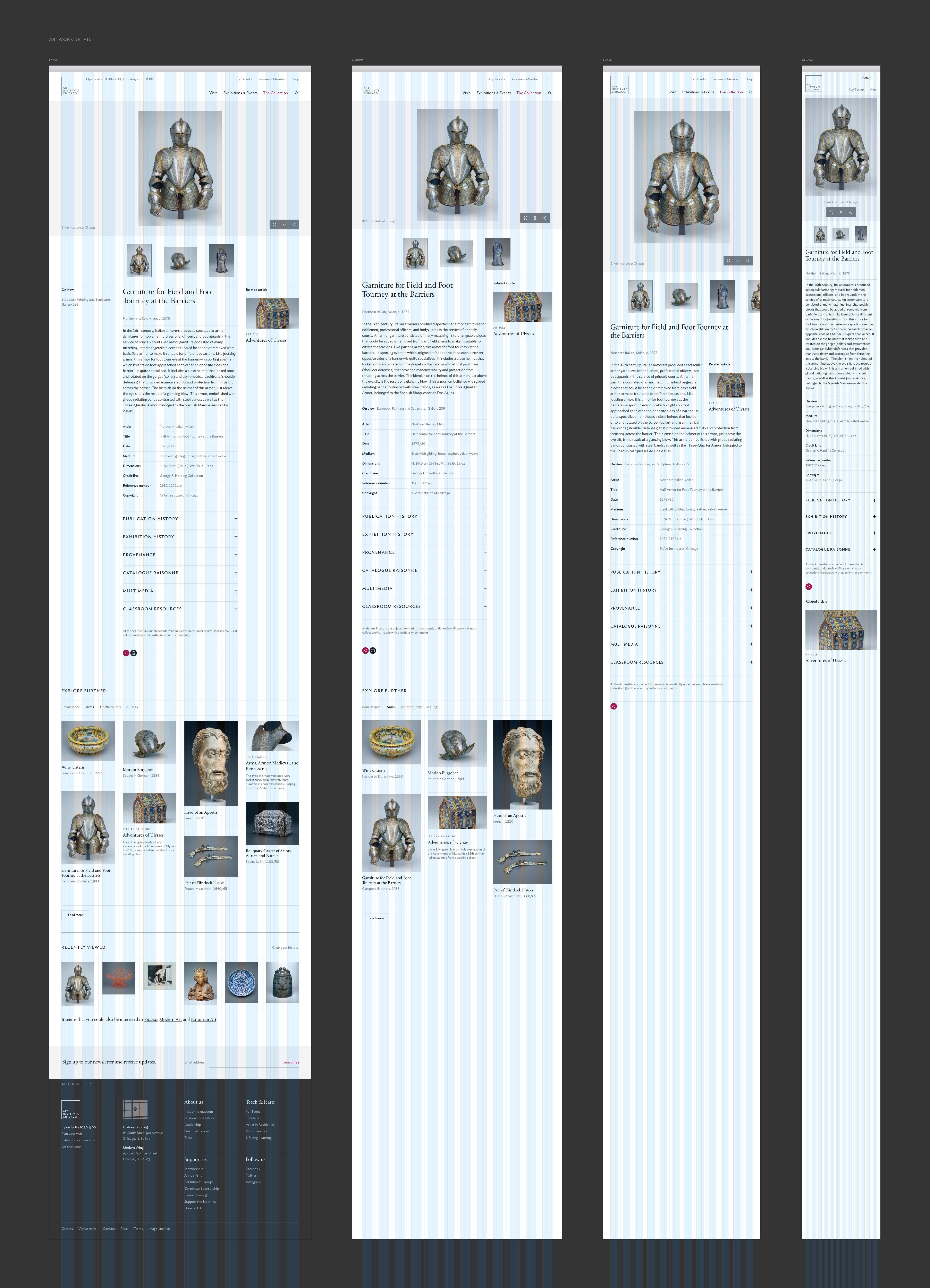
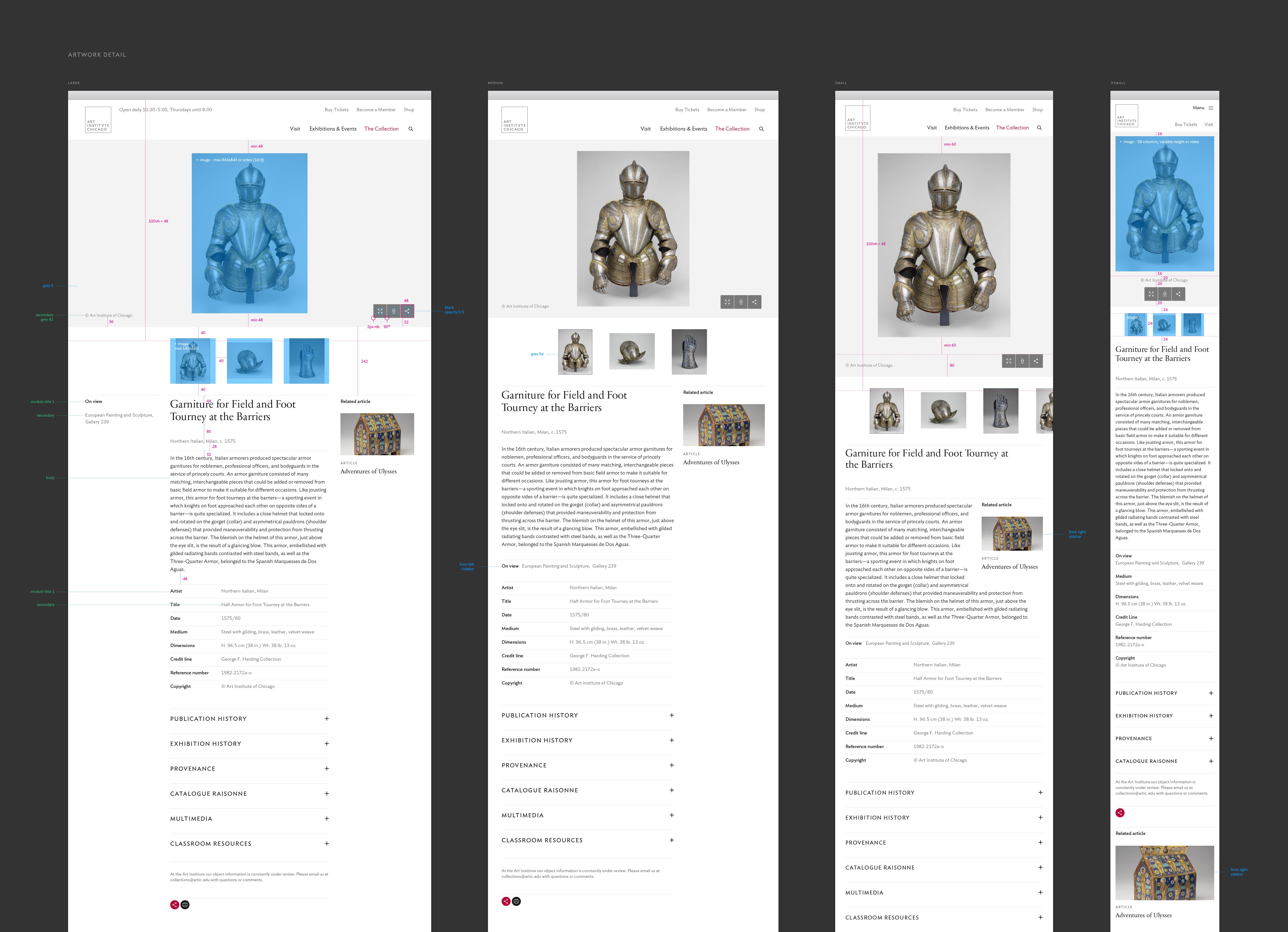
While a type-scale was not used, the typography is rich, elegant and textured, featuring the humanist Ideal Sans for inviting warmth and Sabon Next for classic legibility. The editorial section is distinguished by its own accent color, a dark blue, and uses Sabon for body-text instead of Ideal Sans. Exhibitions and article detail pages have multiple header variants, allowing for type or image-driven pages.
︎︎︎artic.edu