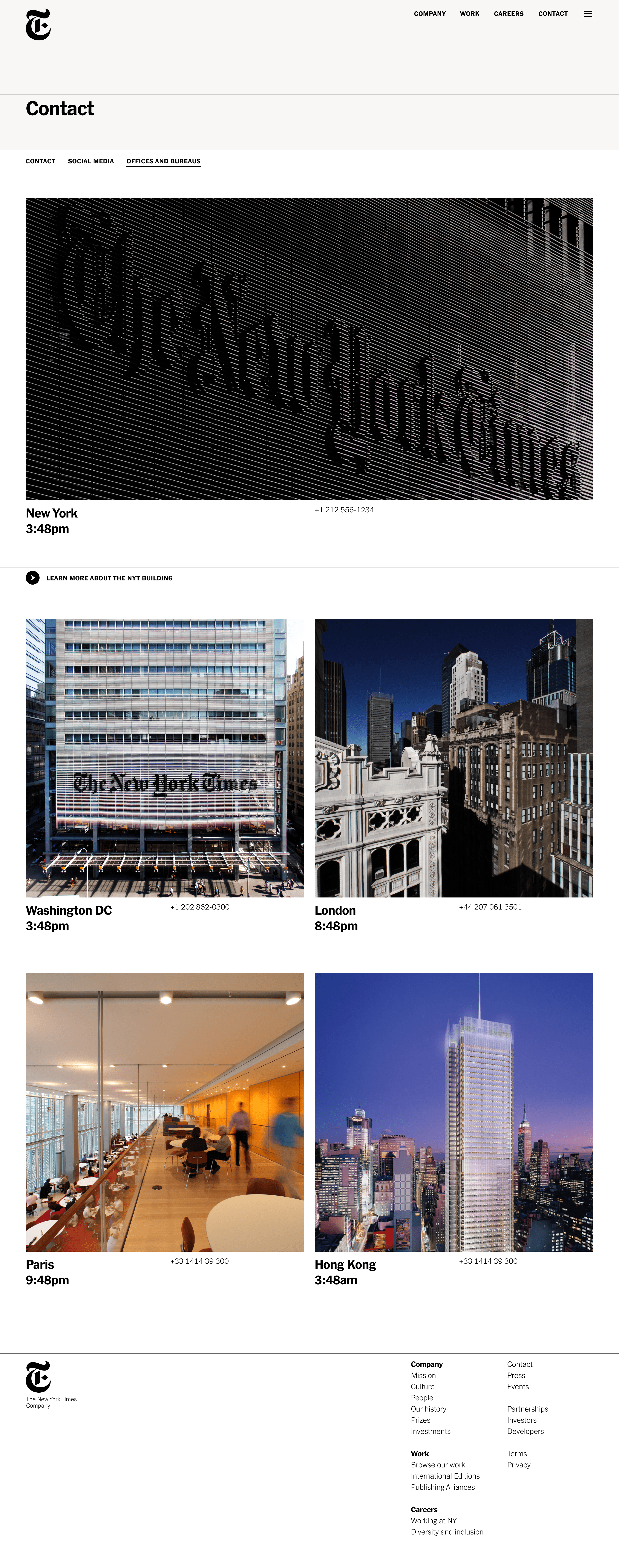
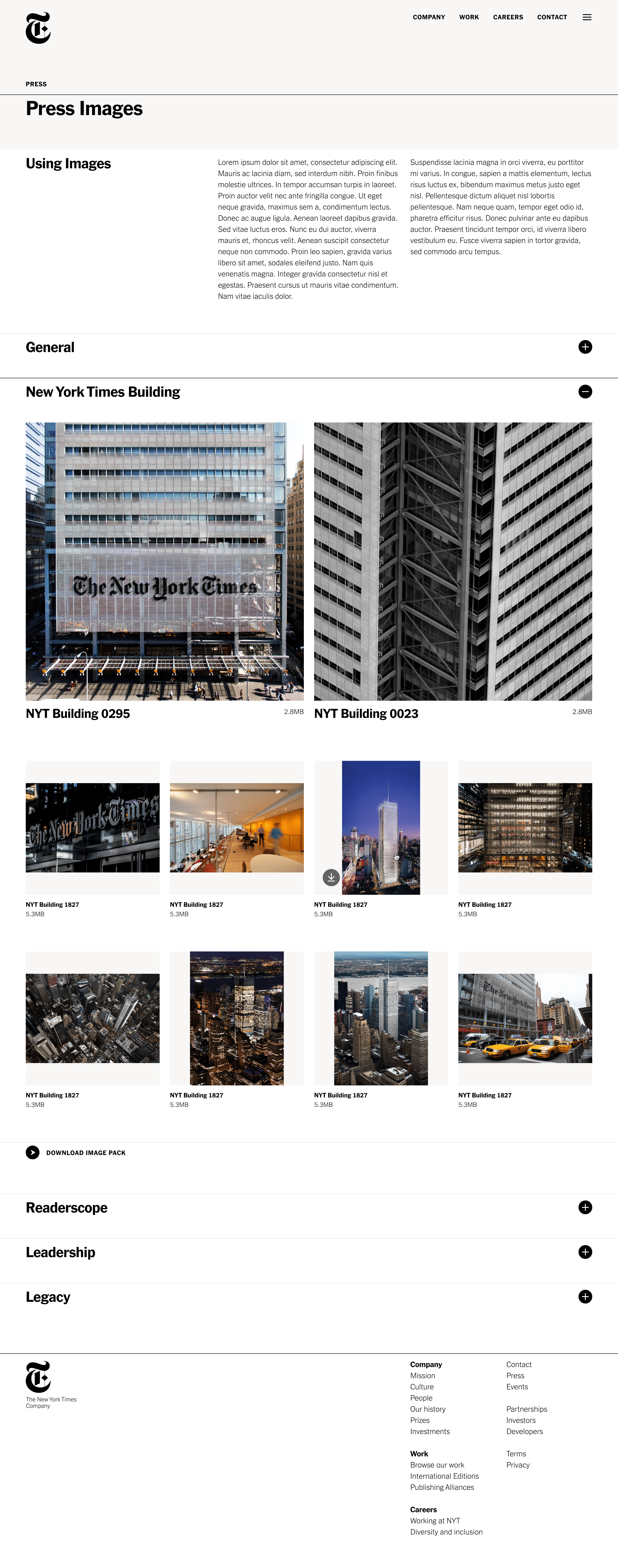
Drawing inspiration from annual reports found in The New York Times Archives, the design features a classic but fresh 3-column approach that creates a print-like aesthetic while being fully responsive to different screen sizes. Rules span the full width of the site, allowing for bold and colorful interactive states, taking cues from the marigold Venetian plaster found throughout the NYT building’s public spaces.
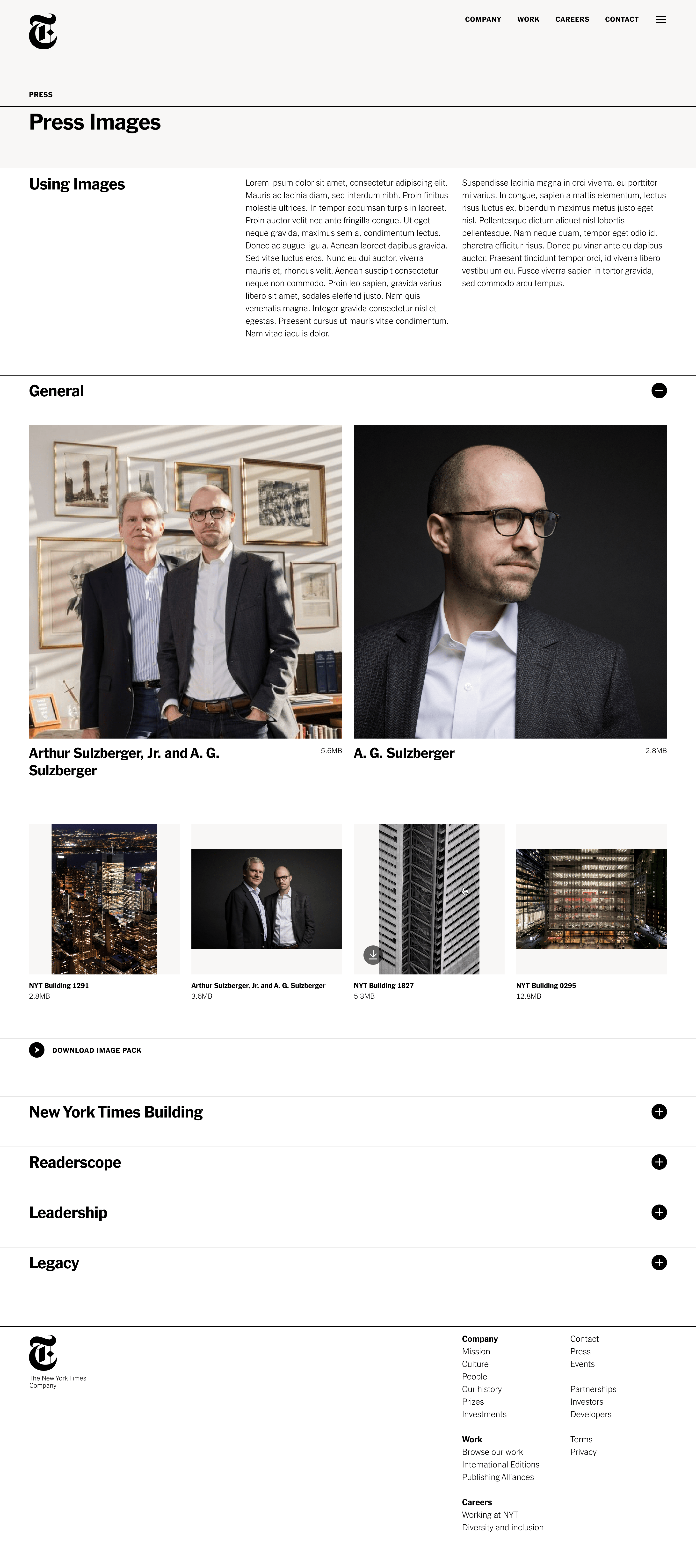
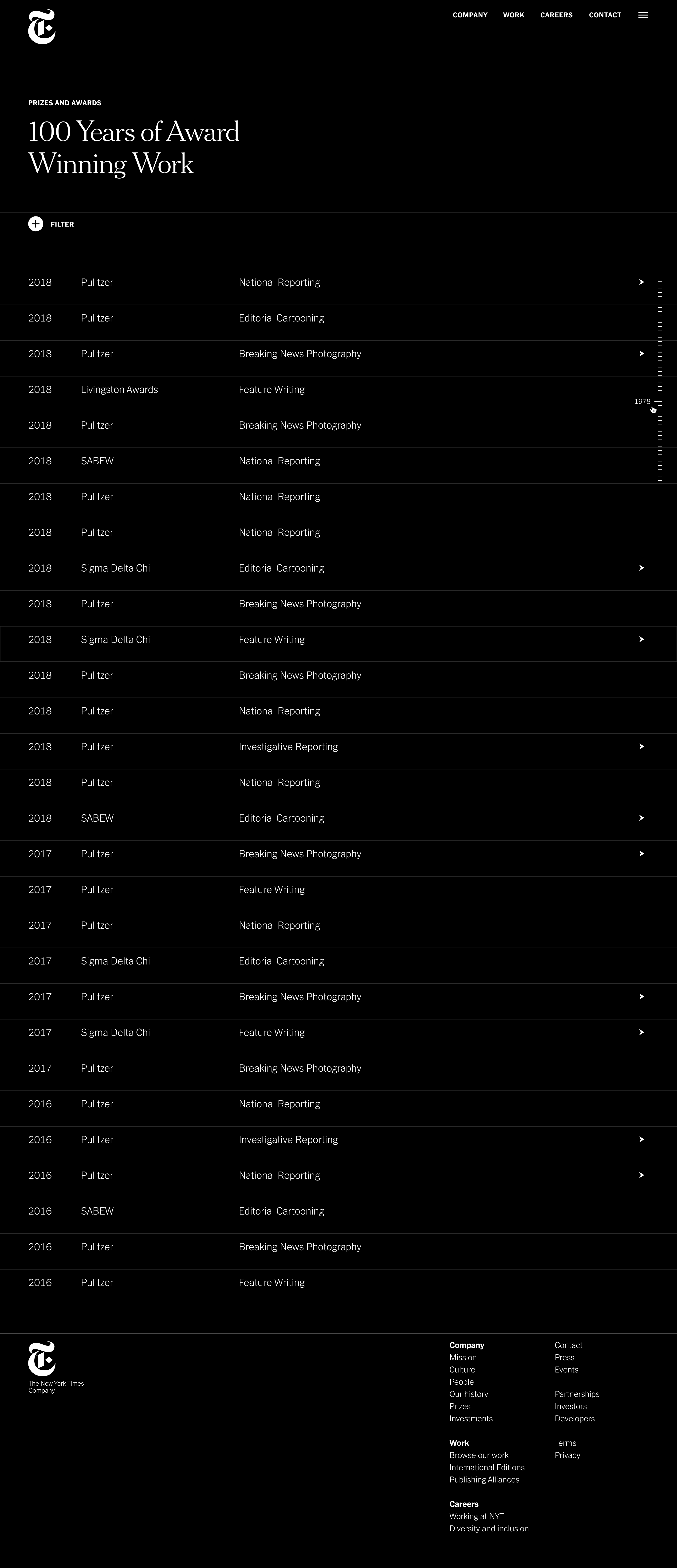
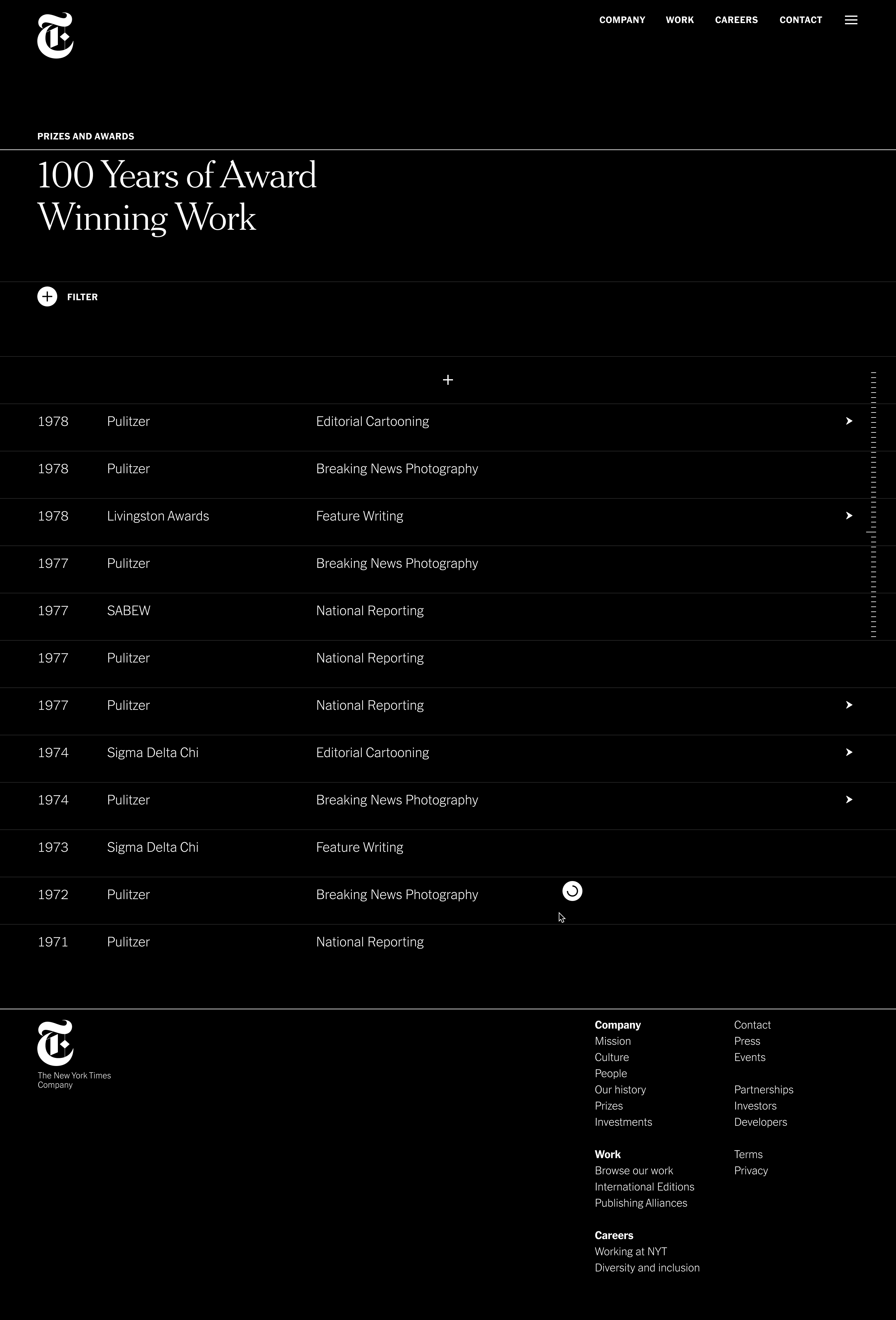
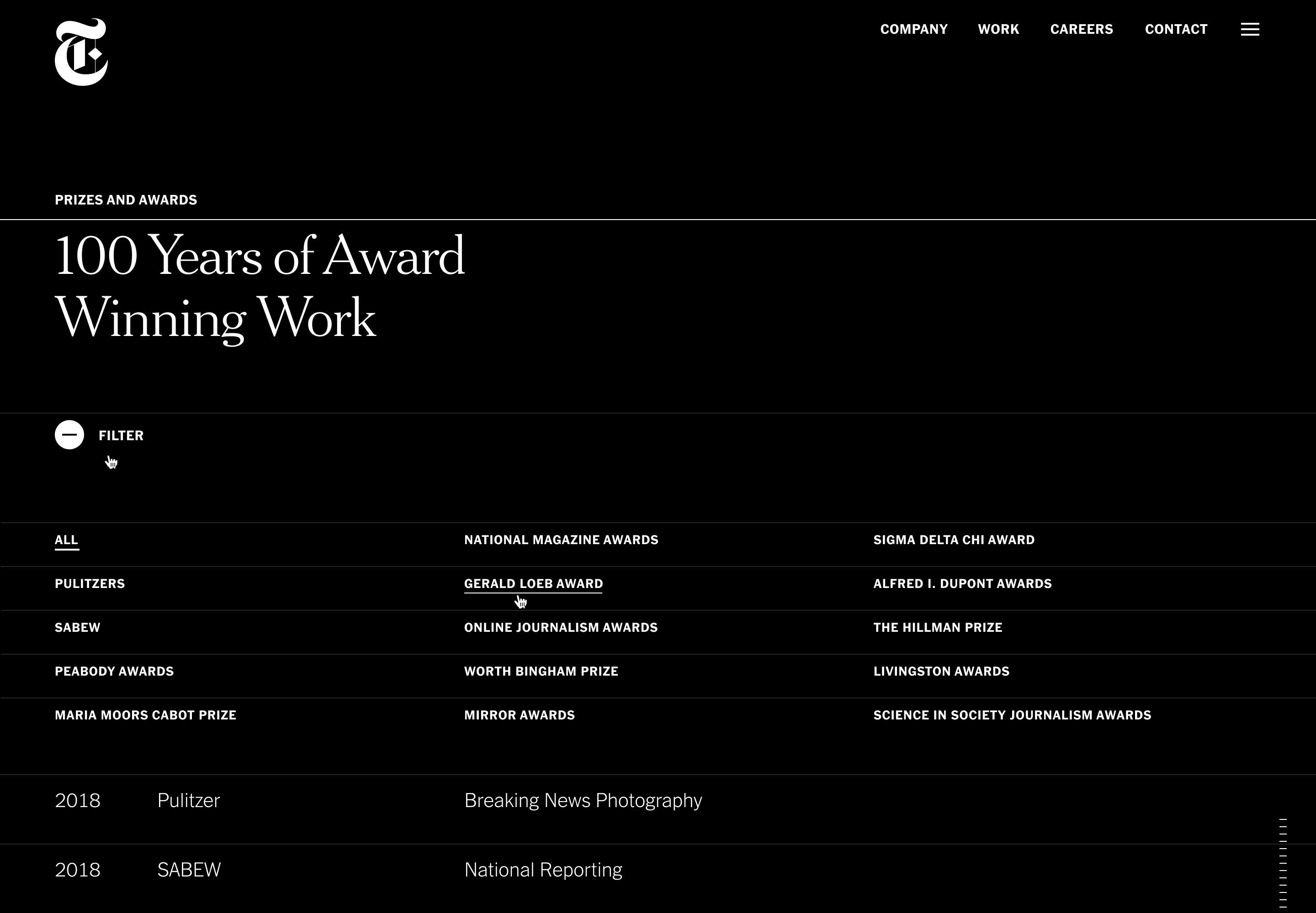
The typography leads with Franklin Gothic, which at the time was mostly the work-horse typeface. In contrast, the more elegant and iconic Cheltenham is more prominently featured showing statistics, and in the history and awards sections which boasts a dark theme for extra immersion.
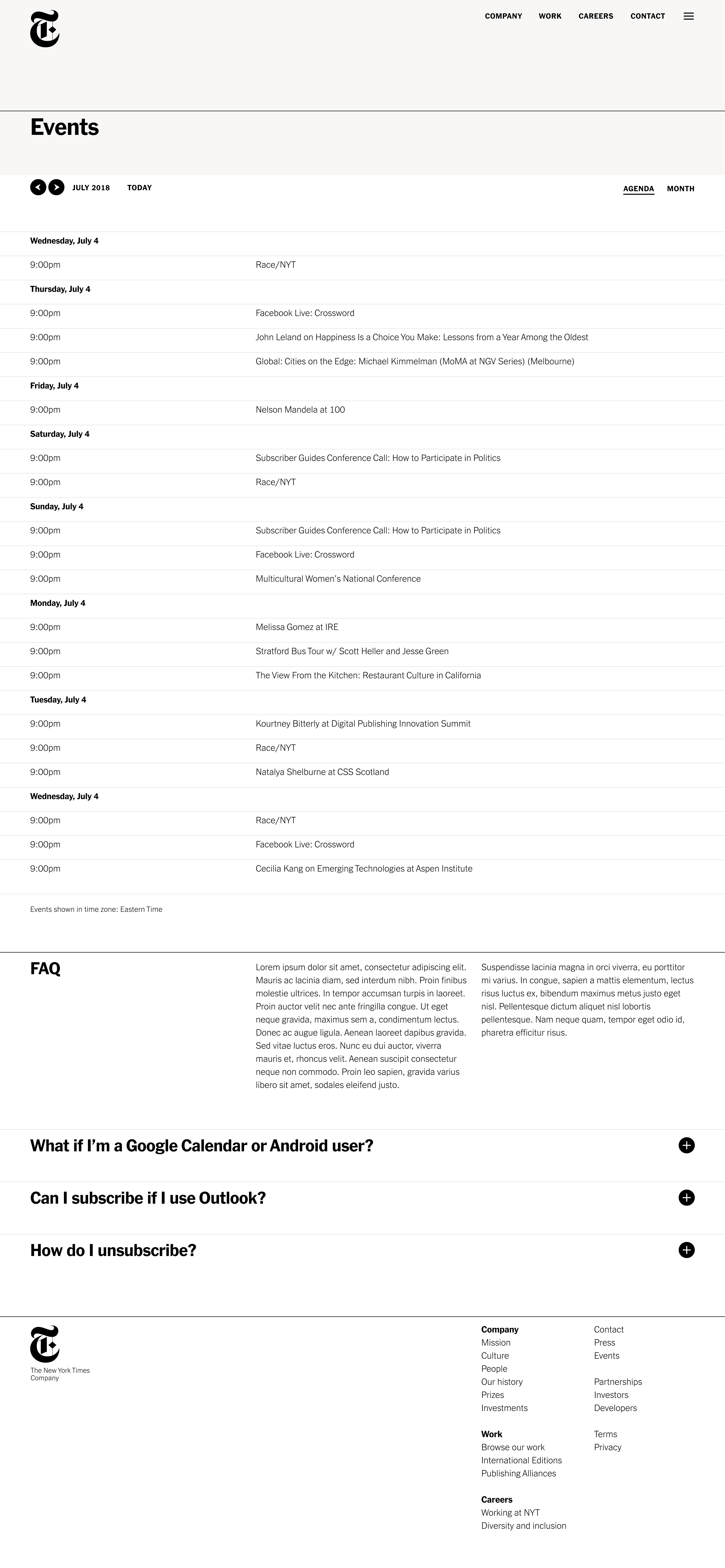
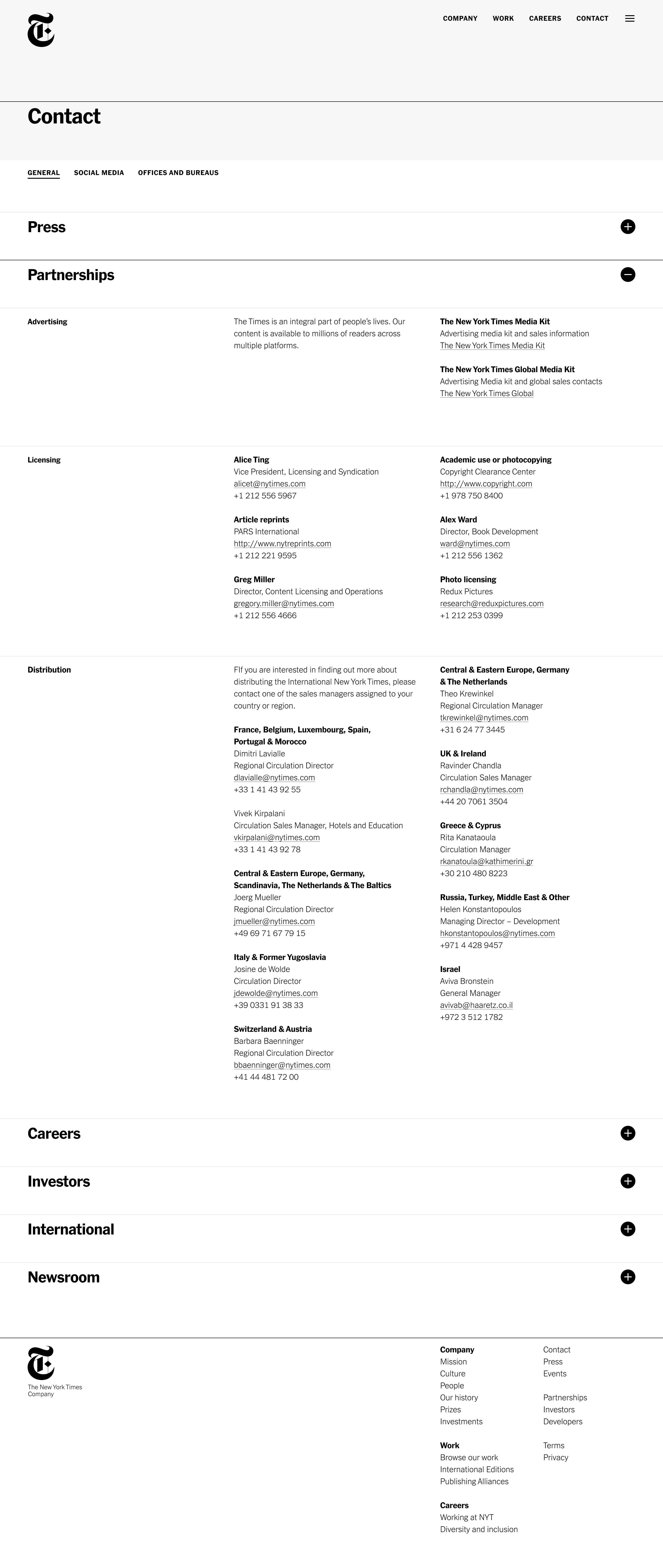
The site is built on a streamlined set of templates, including landing pages, stories, and resource pages, creating a scalable platform. Modals are implemented to seamlessly feature products, people, and media.
︎︎︎nytco.com
The typography leads with Franklin Gothic, which at the time was mostly the work-horse typeface. In contrast, the more elegant and iconic Cheltenham is more prominently featured showing statistics, and in the history and awards sections which boasts a dark theme for extra immersion.
The site is built on a streamlined set of templates, including landing pages, stories, and resource pages, creating a scalable platform. Modals are implemented to seamlessly feature products, people, and media.
︎︎︎nytco.com